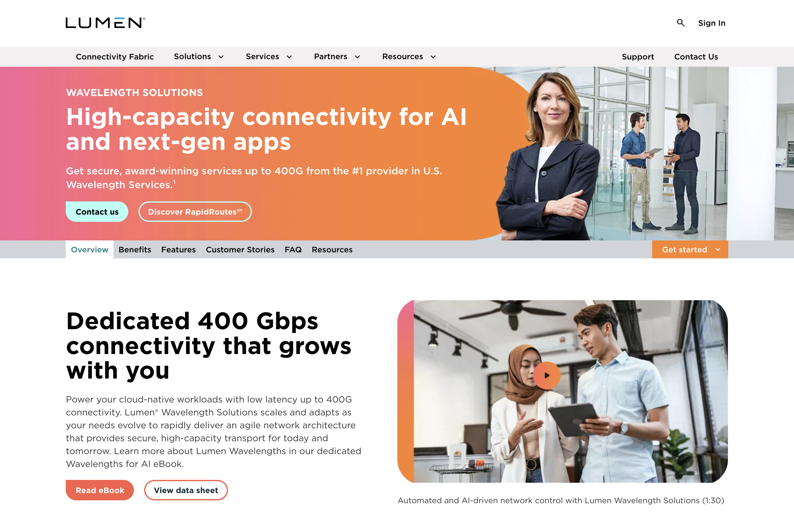
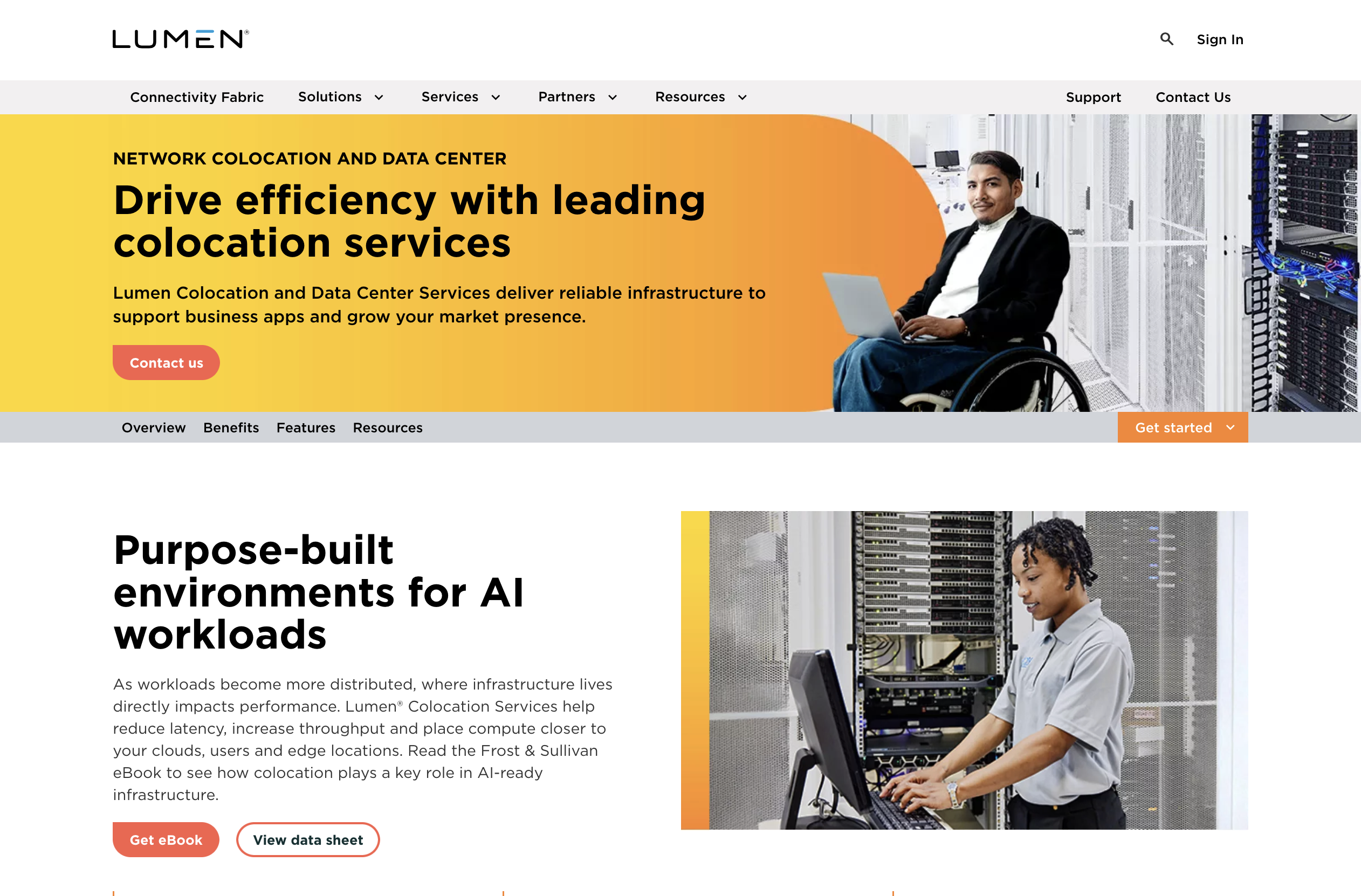
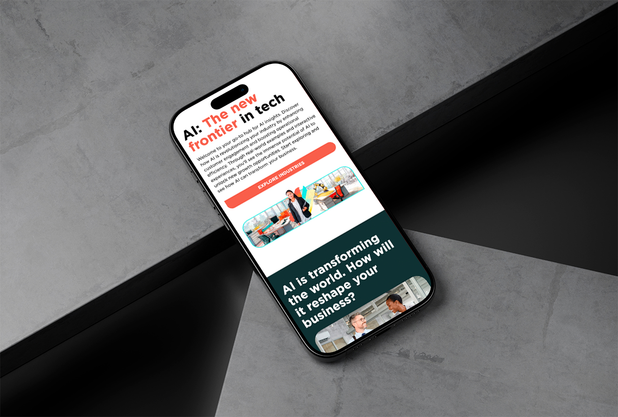
Web Designer · 2022–2025
Three and a half years embedded inside a Fortune 500. I was the team's primary builder and subject-matter expert for ION Interactive and the point of contact for vendor partner Rock Content, which meant the interactive work the team used to buy from a premium external agency got produced in-house instead, removing per-project agency fees and raising how much interactive work we could ship. The projects below were delivered under real enterprise constraints: cross-functional reviews, CMS limitations, tight deadlines, and audiences that demand technical credibility.
A two-question router that sat directly beneath the hero on the Lumen homepage. A visitor says who they are and what they came to do; the second question reshapes itself around the first answer, and the pair produces a starting set of solutions instead of a navigation menu.
Solution Finder was scoped to be built in ION Interactive, the platform I owned for the team. ION delivered its experiences to the page through an iframe, and that broke the one thing this component existed to do: when a visitor clicked a result, the destination page opened inside the iframe rather than in the parent window, a full Lumen page rendered in a box a few hundred pixels tall. ION had no remedy for it at the time.
This was going directly below the homepage hero, the first thing a visitor would see after the banner. An embed that trapped people in a frame was not shippable there.
I offered to build the component from scratch instead, outside ION and directly into the page. The turnaround was short and the ask was to go straight to development.
I pushed back. Something with this much branching, a persona list, a second question that changes shape based on the first, and a result set driven by both, needed to be mocked up before any of it got written. That argument is the reason the rest of this case study exists: I worked with stakeholders to define the inputs and the outputs first, wireframed the flow against them, and only then moved to high fidelity.
Round one put up three ways to ask the same two questions. Each one trades a different thing away.
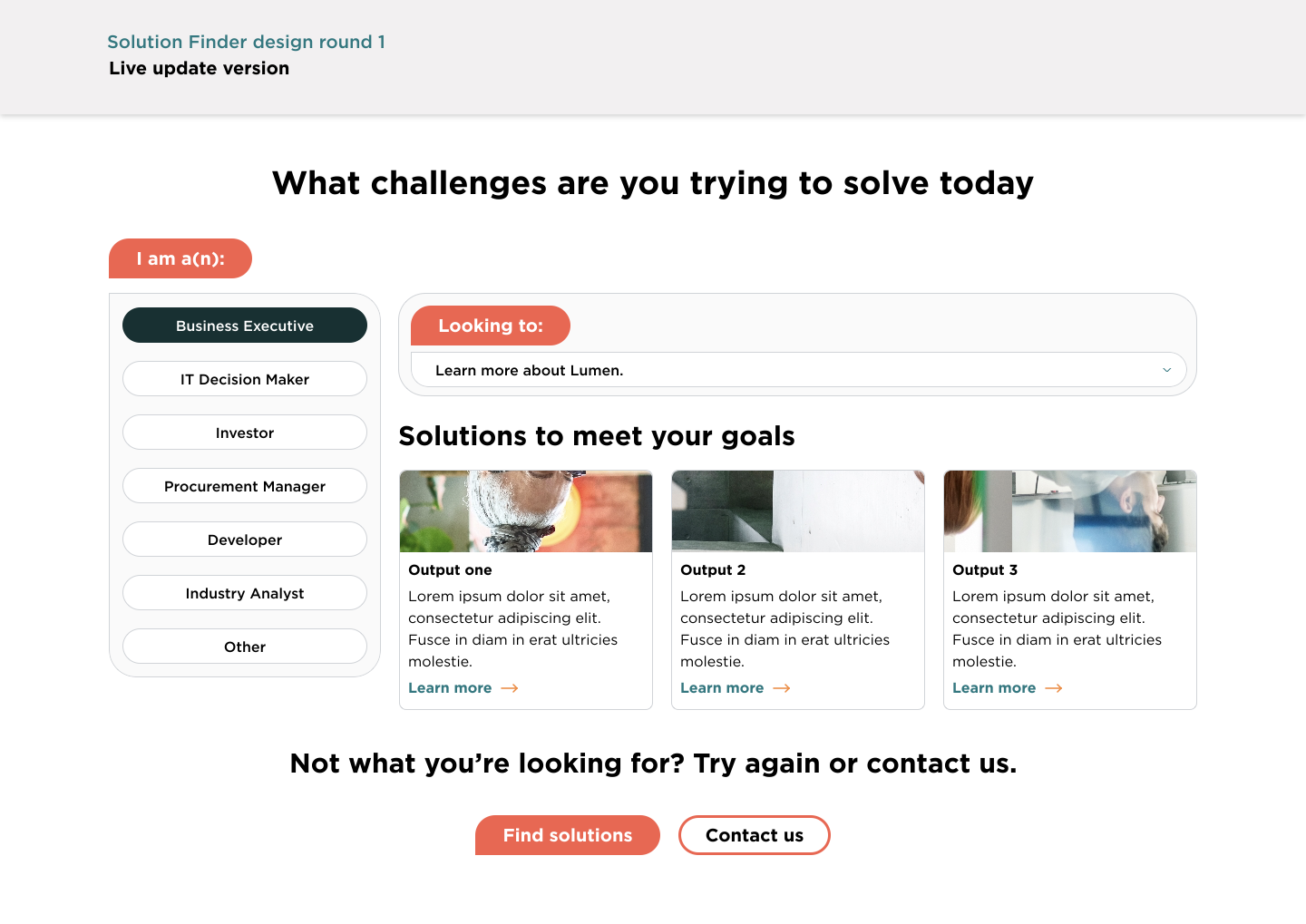
Every persona visible at once as a persistent list, the second question as a dropdown beside it, results re-rendering as you change either. Nothing is hidden and any answer can be compared against another. Costs the most vertical space on a homepage that has none to spare.
View full size ↗
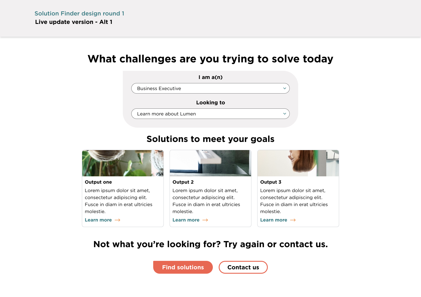
The same live behavior with both inputs collapsed into two stacked dropdowns in one card. Smallest footprint of the three, and the fastest to scan. The trade is that the persona options are hidden until opened, so a visitor cannot see the range of what the tool covers.
View full size ↗
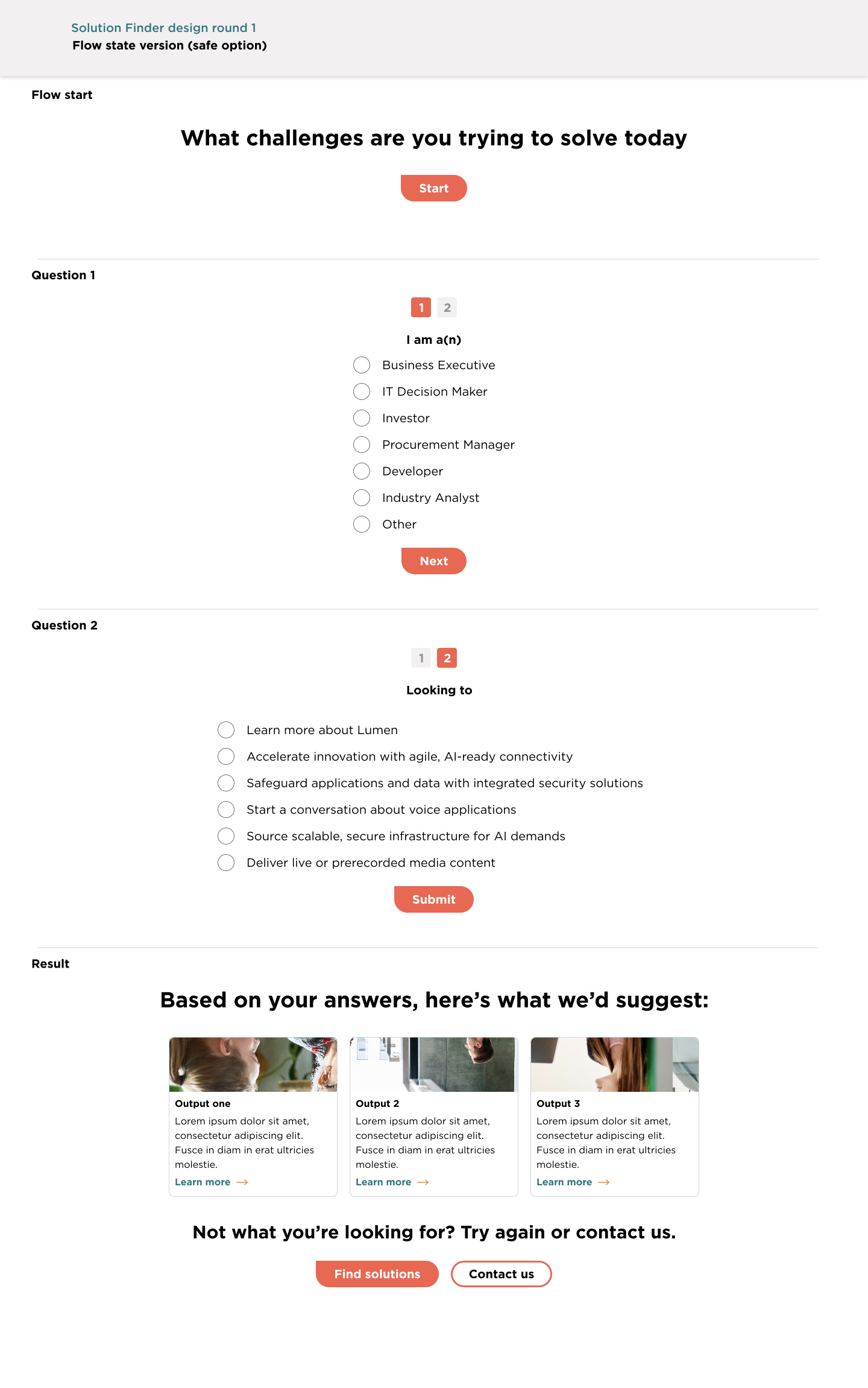
A stepped wizard: start, question one, question two, result, with a two-dot progress indicator. Labeled the safe option in my own file, it was the most guided, hardest to get lost in, and the most screens and states to build and maintain.
View full size ↗Direction A was carried to 360px in the same round. The persona list stacks above the dropdown and the results run full width. The layout question was settled at both ends before anyone picked a direction or any confusion arose.
View full size ↗

Stakeholders chose Direction B and asked to simplify it further to match a pattern another company was already using: the two dropdowns and the heading, with the result panel held in an empty state until both questions are answered rather than sitting open underneath. That is the version that shipped.
Before build I tested that hand-written code could be embedded
into AEM at all, and set CSS naming conventions so my styles could
not collide with what was already on the page. Every class in the
component carries an sd- prefix, still visible in the
archived markup. The integration risk was worth retiring before
the logic got written, not after. The finished component follows
the Lumen Design System, drives question two off the answer to
question one, and carries analytics tagging that captures who is
arriving and what they are trying to do, seeding each group with
the solutions typically advertised to them.
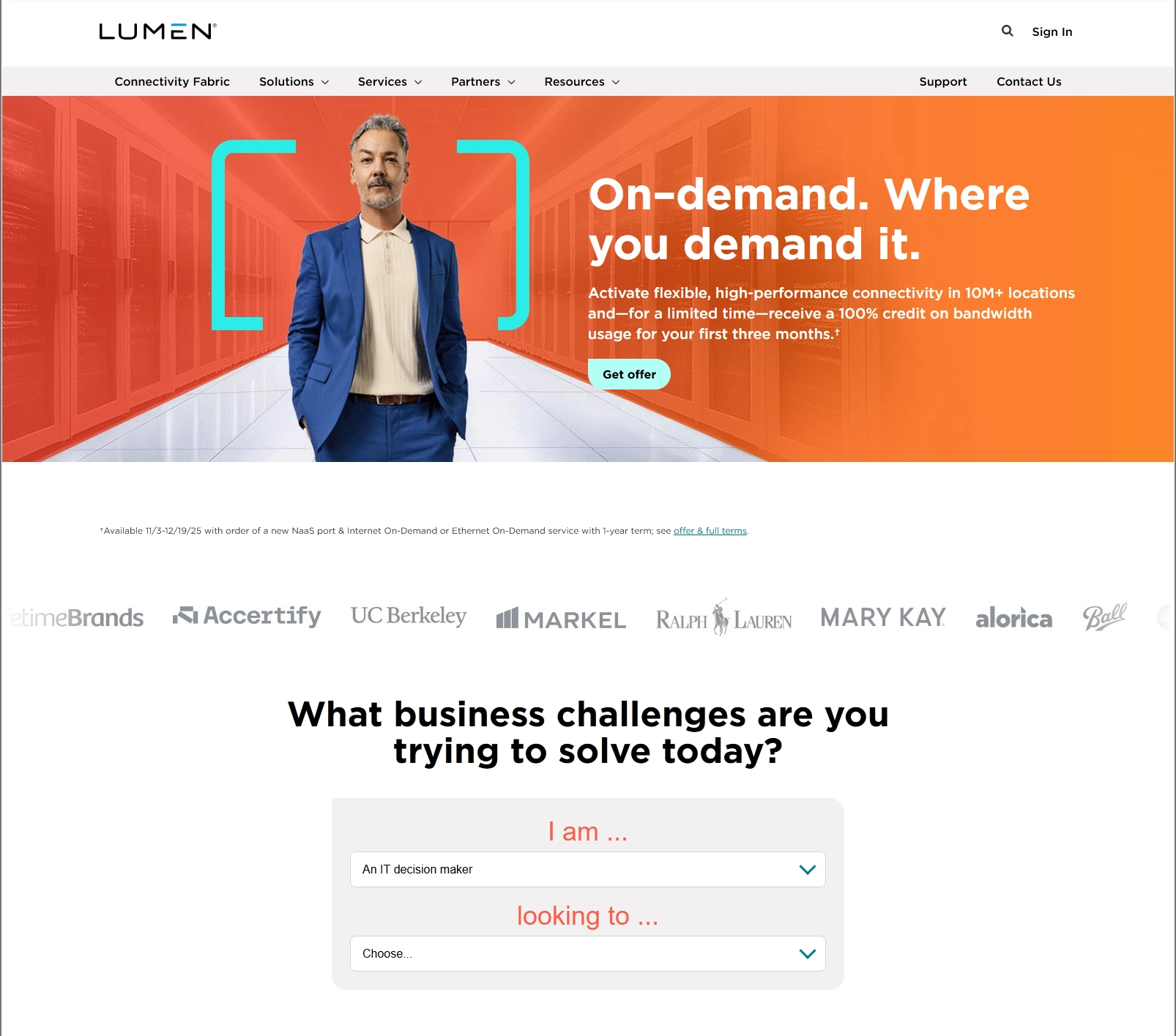
Wayback Machine snapshot, 7 January 2026. The component still runs: choose a role and the second question rebuilds itself around it.
A browsable catalogue of the Lumen portfolio: search, sort and filter across a product set large enough that the navigation menu had stopped being a usable way to find anything. I designed the page and the search system behind it, then wrote the spec engineering built from.
Lumen sells across connectivity, infrastructure, security, communications, media and online purchasing. A visitor who did not already know the product name had no realistic path to it through the top navigation. Product Finder exists to give that visitor a catalogue they can search, sort and narrow instead.
How the filters themselves should behave (what gets grouped, what belongs in the side menu, what a visitor actually reaches for first) was not settled by opinion. Those decisions came out of research the team ran: user research, A/B testing cycles and heatmaps that showed how people were moving through the existing pages. I sat in that work, reviewed the results with the group, and applied what it pointed at to the filtering and the side menu.
Before Product Finder, I designed a site-wide search enhancement: every state of finding something on lumen.com, drawn at 1440, 768 and 360. Rather than invent a second search pattern for Product Finder, the plan was to carry this same system into it: one behaviour for a visitor to learn, one set of components for engineering to build.
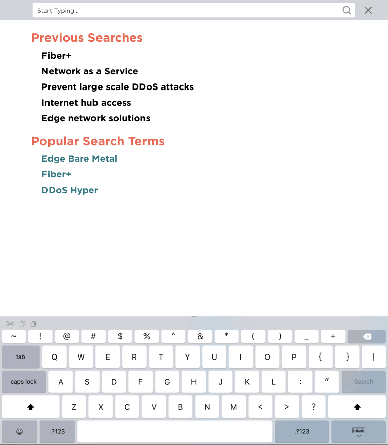
An empty search field is a dead end, so it opens with previous searches and popular terms, something to press before a visitor has typed anything. Drawn with the software keyboard in frame, because on a phone the keyboard takes half the usable height and the list has to survive that.
View full size ↗
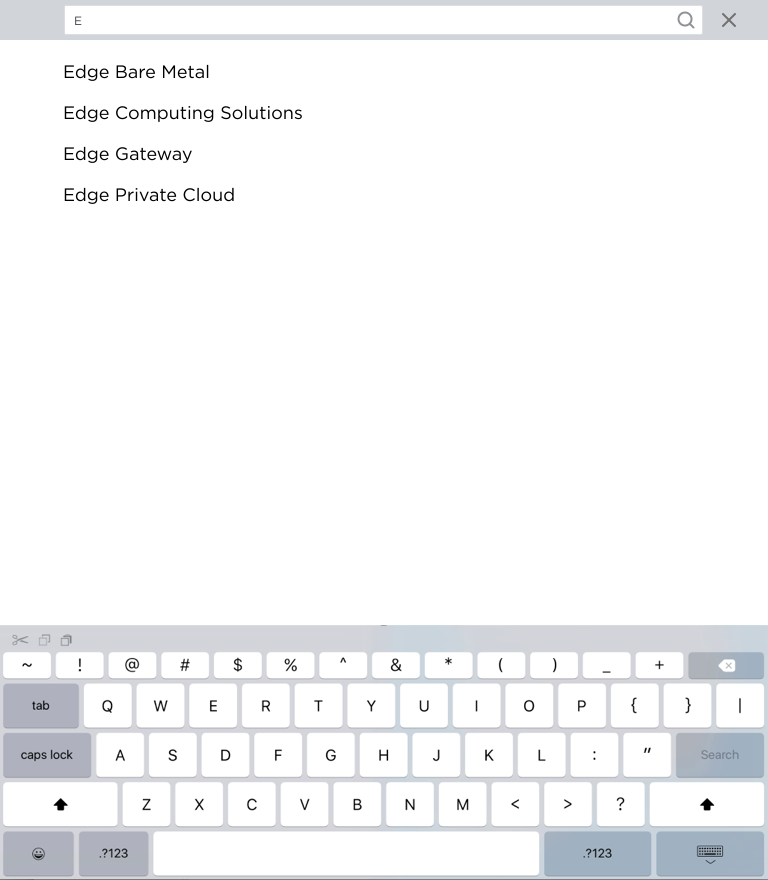
One character in, the list narrows to real product names: Edge Private Cloud, Edge Gateway, Edge Computing Solutions, Edge Bare Metal. Matching on the product set rather than free text means a visitor lands on a page that exists instead of a results screen that apologises.
View full size ↗
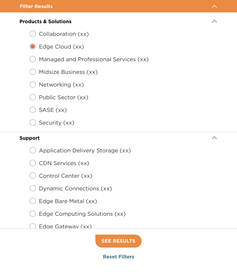
Below desktop the sidebar becomes a drawer. Every filter carries its own result count so a visitor can see what a choice costs before making it, and the drawer commits on See results rather than reloading under them on each tap. Reset is always reachable.
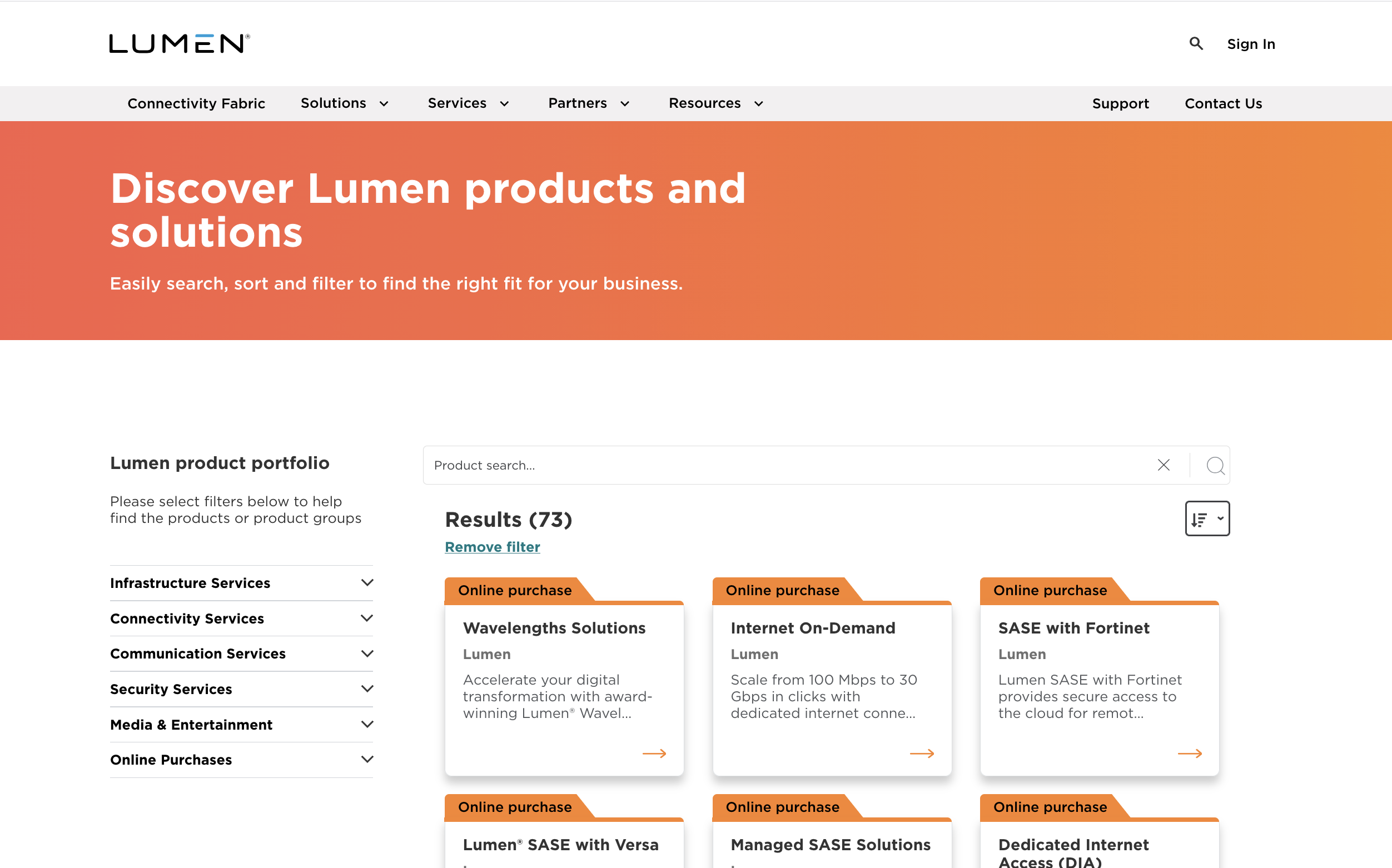
View full size ↗The results view holds the same furniture at every breakpoint: the query echoed back, a count that admits how much is being hidden, applied filters as removable chips with a remove all, and sort by relevance, popularity or alphabetically. On desktop the filter groups sit open in a 300px rail; on mobile the whole thing stacks and the rail becomes the drawer.
Desktop, full size ↗
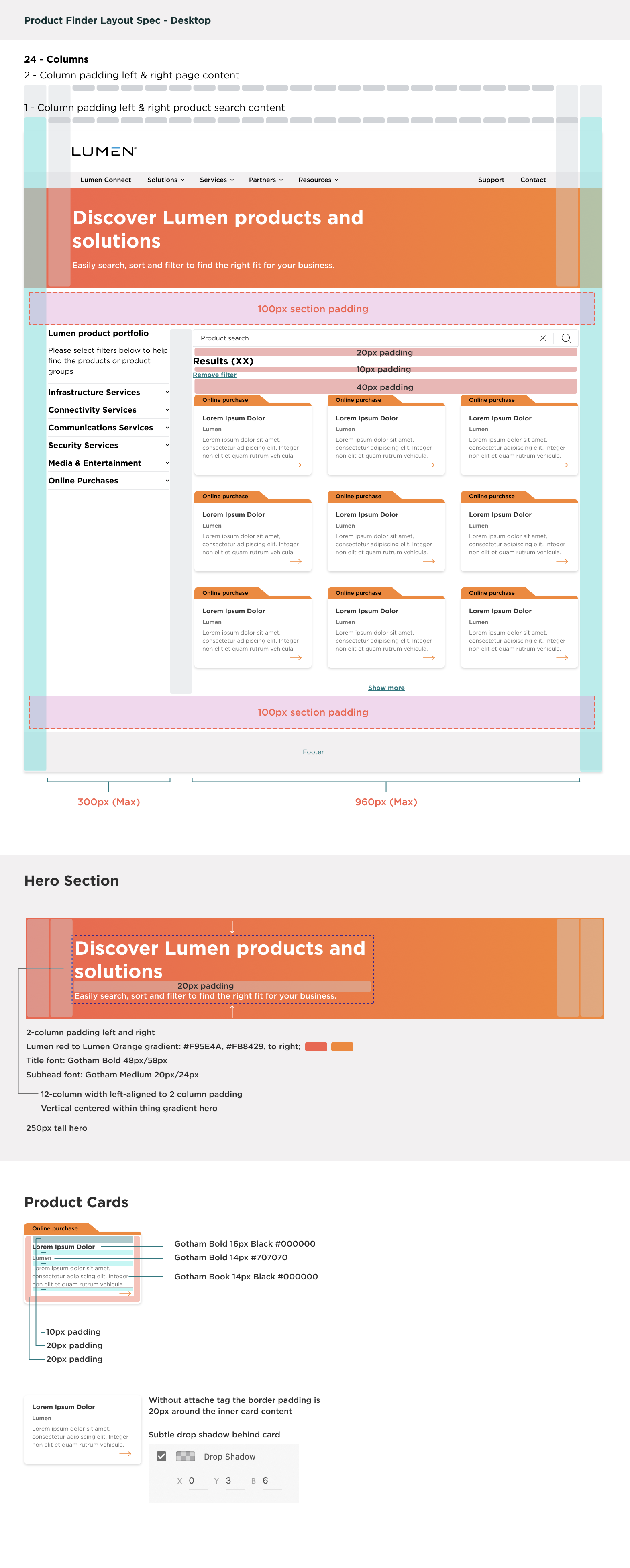
I did not build Product Finder. Engineering implemented it in Adobe Experience Manager, which made the specification the actual deliverable. If it left a question open, the answer got invented in code and came back wrong. So the handoff was annotated down to the values a developer would otherwise have to guess.
The layout sheet below pins the page to a 24-column grid with
two-column page padding and one-column padding inside the search
content; a 300px filter rail against a 960px results area; 100px
section padding above and below. The hero calls its own gradient
(#F95E4A to #FB8429, left to right), a
250px height, and a 12-column measure. The card sheet specifies
Gotham Bold 16px on black for the title, Gotham Bold 14px on
#707070 beneath it, Gotham Book 14px for the body,
the 10 and 20px paddings, what changes when the tag is absent, and
the drop shadow as x0 y3 blur6.
I designed this page twice: once under the earlier blue Lumen identity, and again for the current red and orange system shown here. Doing the same page through two visual languages is a useful test of whether the structure was ever right. The grid, the filter model and the card anatomy carried across, and only the surface changed.
A scroll-driven animated infographic mapping Lumen's network evolution, produced for a campaign landing page. Enterprise infrastructure is notoriously hard to visualize. This piece made it tangible: motion reinforces the narrative, hierarchy guides the eye, and every diagram earned its place through storyboarding and iteration.
I handled end-to-end production: wireframing in Figma, motion prototyping in After Effects, CSS/JS implementation in ION Interactive's CMS, and final accessibility and performance QA.
View Live
A continuous stream of design and development work maintaining page integrity across Lumen's digital properties. Updates ranged from layout tweaks and accessibility remediations to full responsive overhauls and cross-browser bug fixes, all shipped under daily production cycles.
This work sharpened the operational side of design: reading inherited codebases fast, making high-confidence changes under time pressure, and keeping quality consistent across hundreds of discrete touchpoints.
A design and presentation framework built to visualize Lumen's AI product suite, translating abstract infrastructure capabilities into a tactile, interactive experience layer. The challenge was making enterprise AI feel concrete to a technically sophisticated audience.
I led the visual system design and built the interactive prototype from scratch, defining hierarchy, motion language, and a component architecture that could flex across future product announcements without redesign.
View LiveThree and a half years of production across campaign systems, product tools, and interdepartmental collaboration, each piece positioning Lumen as a technically credible, design-forward enterprise brand. The work demanded the full range: research and strategy at the top, pixel-level execution at the bottom, motion, engineering and has shaped the creator I am today.