Case Study 001

Ouros
Designs

A shop I own outright, built to cost me almost nothing until I have something to sell in it.

Design + Development · Astro · Supabase · Stripe · Resend · Pre-launch
Why I built it

I make things and I needed somewhere to sell them. Not a listing on somebody else's marketplace, and not a storefront I rent by the month that takes a cut of every order. I wanted a shop I own end to end, one I can run a small business under, and one that costs almost nothing to leave standing while I get the first products finished.

01

It stays mine

No platform to get locked into. The code, the data and the domain are all mine, and I can move the whole thing if I ever need to.

02

The margin stays put

There's no cost of goods on a digital file, so every monthly fee comes straight out of what I keep. I'd rather not have any.

03

Ready before the product

I built the whole path first: browse, buy, deliver, receipt. That way opening the shop is just a matter of having something to put in it.

01

Built to cost
nothing when
it's quiet

I picked every piece of this the same way. What does it cost me in a month where I don't sell anything?

01 / 04
Framework

Astro

The shop builds down to plain files, so there's no server sitting there waiting for someone to show up. It's static assets on a CDN, and JavaScript only loads where a piece of the page actually needs it.

At rest: $0
Data & files

Supabase

Catalog, accounts, and the protected storage that downloads get signed against. A shop this size fits well inside the free tier, and it's just Postgres underneath if I ever have to move it.

At rest: $0
Payments

Stripe

Hosted checkout, guest only. I pay per transaction, so a quiet month costs me nothing and nobody takes a platform cut on top of the processing fee.

At rest: $0, per sale only
Delivery

Resend

Order receipts and download links. This is the one part that has to work on the very first sale, and the free tier covers a lot more email than I'm going to send for a while.

At rest: $0

What it costs me to leave Ouros standing: the domain renewal. Everything else I only pay for when something sells, which means the shop can sit closed for as long as it needs to.

02

The design system

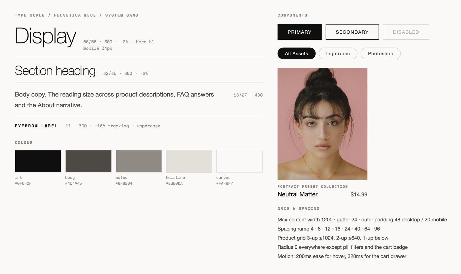
What I'm selling is photography, so the site had to stay out of its way. I set the type scale, the colours, the spacing and the components before I drew any screens. It's a small system on purpose, small enough to keep in my head, which matters when I'm the one building it.

Design foundations sheet: type scale, five-colour palette, buttons, filter pills, product card, grid and spacing rules.
Type, colour, spacing and components.
01

One background colour and one text colour. All the other colour comes from the photos.

02

Light weights at big sizes. Never bold for emphasis, use letter spacing.

03

Monospace for the specifics: file sizes, categories, order numbers.

04

Hairlines instead of cards. No rounded corners except the filter pills.

03

The screens

Five screens, two sizes. Scroll a frame and the page inside it scrolls with you.

Screen 01

Home

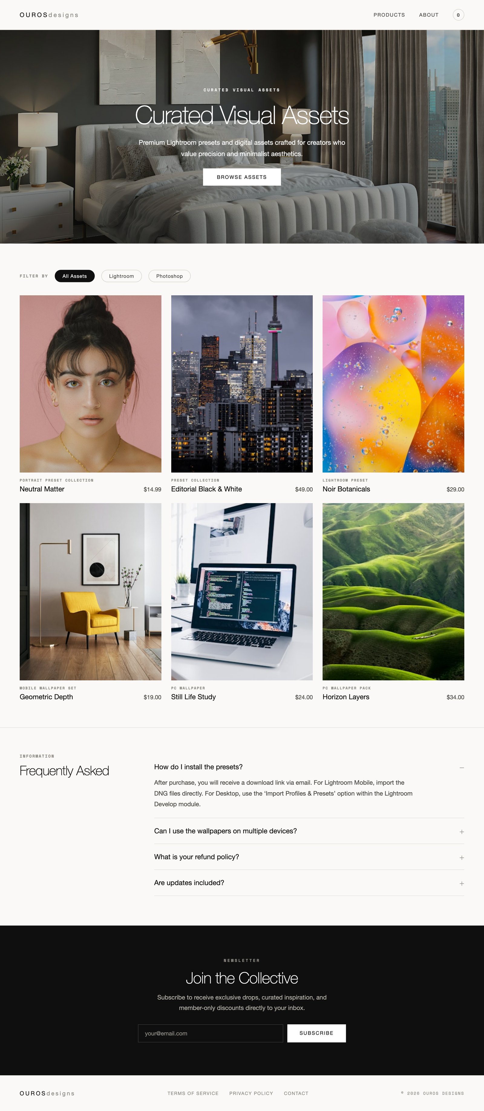
The hero, the grid, the filters, the FAQ and the newsletter, all on one page. With a catalog this small a filter beats a menu, but the filter writes to the URL so a link to just the Lightroom presets still works if I grow.

ourosdesigns.com
Hi-fi wireframe of the Ouros Designs home page at 1280 wide.
Screen 02

Product page

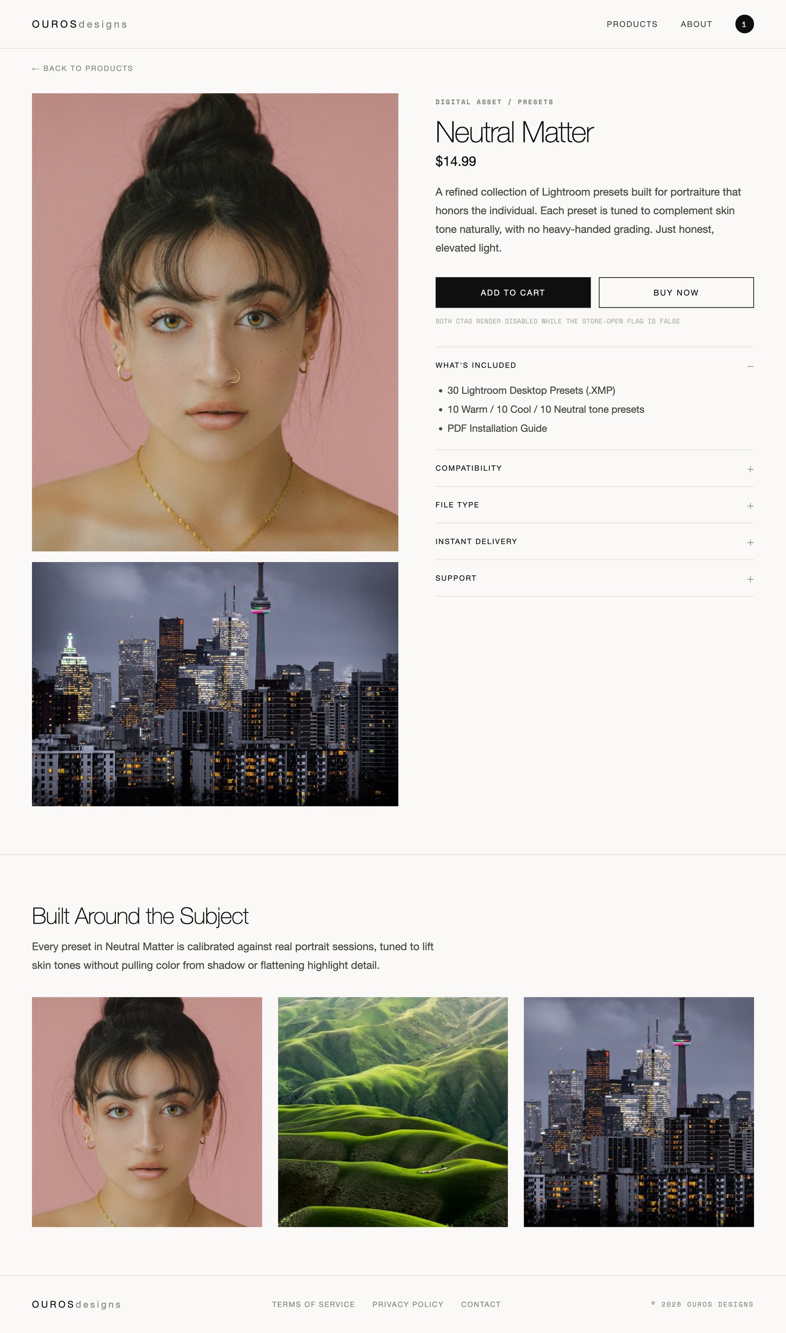
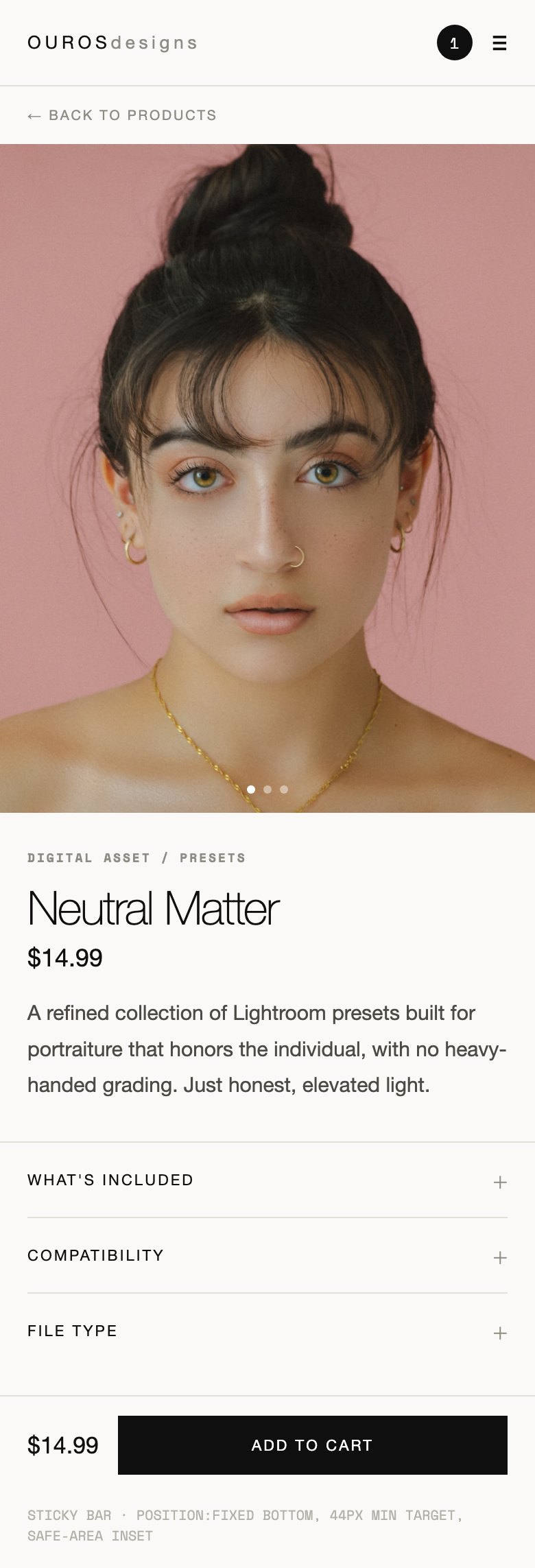
Show the work first, then answer the practical questions. What's included is open by default, and compatibility, file type, delivery and support sit right there instead of buried four clicks deep in an FAQ.

ourosdesigns.com/products
Hi-fi wireframe of a product detail page for the Neutral Matter preset collection.
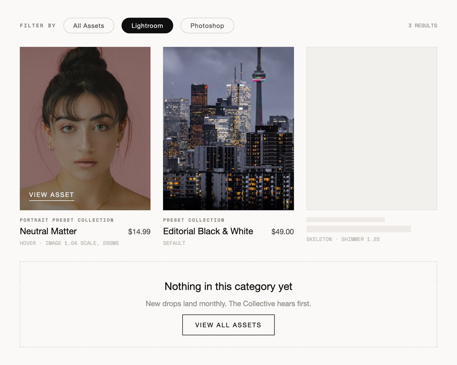
Product grid states: filtered results, hover treatment, loading skeleton and an empty category.
Grid states: default, hover, loading, empty. I drew them up front so I wasn't inventing them halfway through the build.
04

Two things I had to decide

Closed on purpose

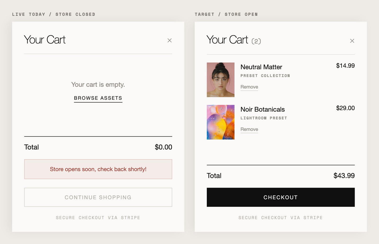
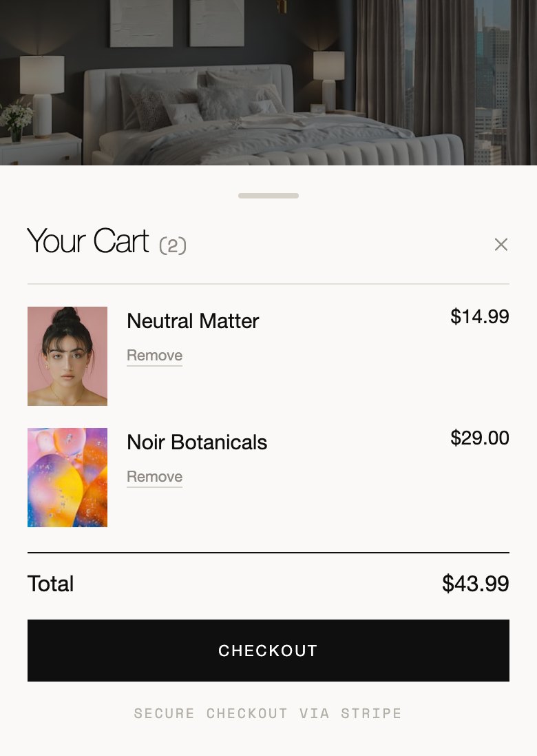
I don't have product yet, so the honest version of the cart is an empty one. I didn't want that to look broken, so I designed the closed state instead of patching it later. One flag runs the cart, both buttons on the product page and the badge in the header, and it says plainly that the shop hasn't opened yet. Flip the flag and it's the live cart.

Cart drawer shown twice: the closed-store empty state on the left, the live filled cart on the right.
The cart. Closed today, open on a flag.
The receipt needed its own page

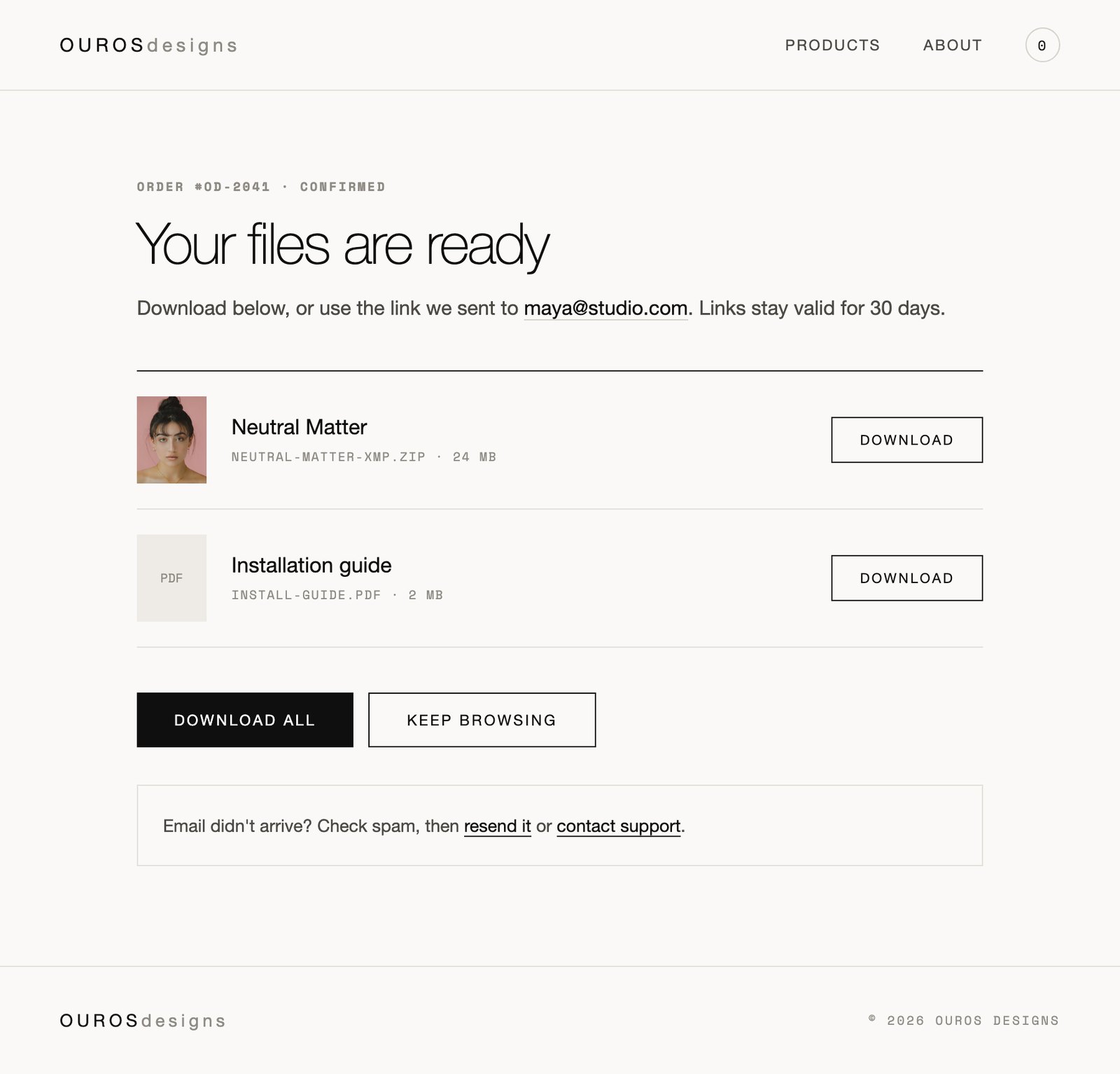
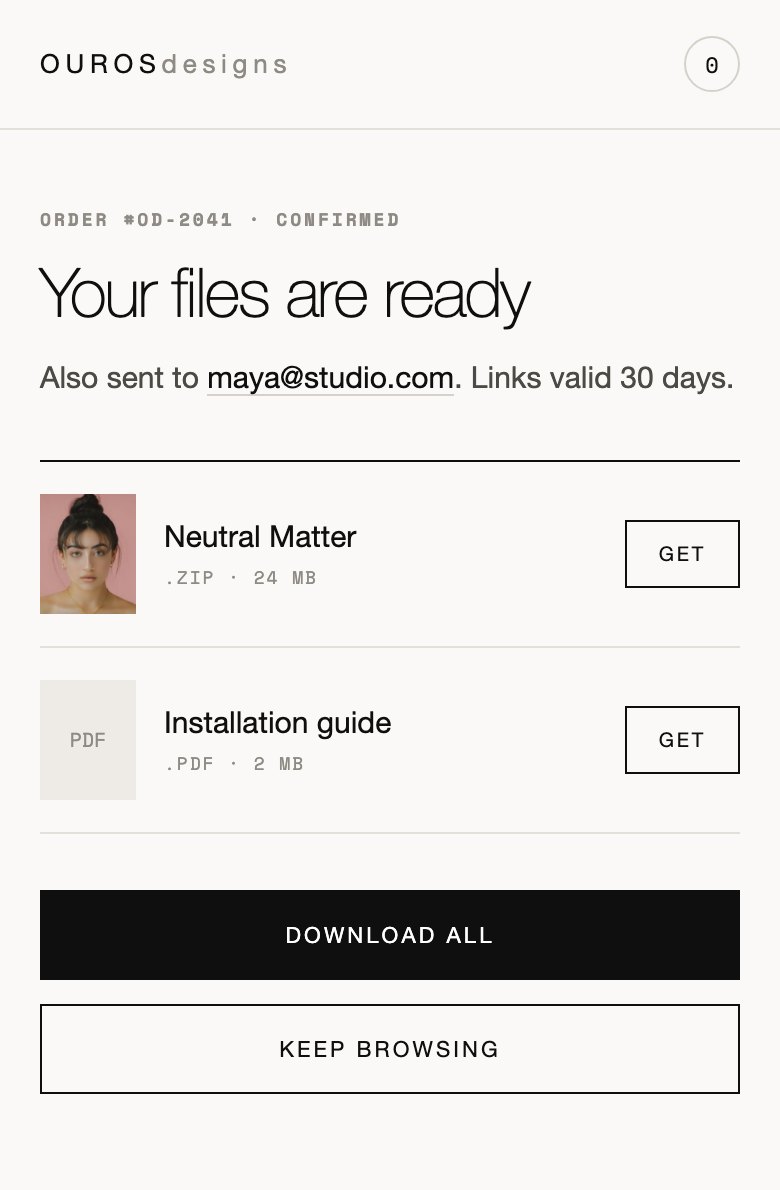
If the only thing a buyer gets is an email, then the most fragile moment in the whole shop happens somewhere I can't see it. So the confirmation page is a real page. It checks the Stripe session, signs the download links, empties the cart and gives people somewhere to come back to. It's the only piece of real backend work in here, and it's the part that decides whether someone trusts me with twenty dollars.

Order confirmation screen listing purchased files with download buttons and a resend option.
Confirmation and download. New, and checked against the checkout session.
05

390 wide

Most people are going to find this on a phone. I drew the whole flow at phone width alongside the desktop version instead of shrinking it down afterwards, including the buy bar that stays at the bottom and the cart as a sheet rather than a drawer.

Keep scrolling →
Mobile home screen with hero, filter pills and a single-column product grid.
Home. One column, filters first.
Mobile product detail screen with a sticky buy bar pinned to the bottom.
Product. Price and buy stay at the bottom.
Mobile cart shown as a bottom sheet with line items and a checkout button.
Cart. A sheet, not a page.
Mobile confirmation screen listing purchased files with download buttons.
Confirmation. Files in hand before the email lands.
06

Where it is now

The hard part is done. The catalog, checkout, signed delivery, receipts and the closed state are all built and tested, and the shop is one flag away from taking money. What I don't have yet is product. It's sitting at the last step on purpose until the first collection is finished.

Done

Brand, design system, five screens

Done

Checkout, delivery, receipts

Waiting on

The catalog

View Live
Continue Browsing
← Back All Projects Next → Lumen Technologies